How to Make Charts in MsExcel?
Here is the secret that many people do not understand, Excel is one of the best data visualization tools available. This is because the tool comes with a familiar user interface that you can easily master and implement in your daily operations. Also, Microsoft Excel has been in existence for decades, making it the most appropriate option for data visualization.
In addition, Excel generates compelling charts that you can use in visualizing data for your target market. However, many people do not understand how this works. Don’t worry because this article walks you through some of the best charts in excel. Let’s get started!
1. Slope Chart
Slope charts are considered to be simple forms of graphs that showcase transitions, absolute values, and changes within a speculated time frame. This chart type is mainly used before and after a story of different variables. If you have two time periods or a couple of points comparison, you can use this chart type to identify any increase or decrease across the categories.
Even though a slope chart sounds like an easy element to use, you need to understand how you can create it before feeding in the necessary information. What is the procedure for creating a slope chart? Check out the subsequent discussion! Once you have collected all your respective data, the next step is to copy it into Excel in the form of a table.
Check on the available options and click on the access button to access the app’s options. On the displayed options, click on the ChartExpo add-in, which will open a library of charts categorized into different groups. Within the displayed categories, click on the pay per click option, which will give you access to the slope chart. On the sheet holding the data, click on the create chart option. At this point, you will have a slop chart created with the data you have.
Once the chart has been created in Excel, you can analyze the insights depending on the nature of your data and create a sound conclusion.
2. Matrix Chart

A matrix chart showcases an advanced form of the traditional bar chart used in the ancient days. The difference in this chart is that the bars available in this chart are closely stacked on each other to make the comparison process easier. The chart appears parallel to the data to enable you to highlight possible differences easily.
The most exciting thing is that a matrix Chart is easy to read and interpret. Readers do not need to have any technical skills to comprehend the concept outlined in the data displayed in the matrix chart. But how do you create and use a matrix Chart in Excel? Copy and paste your data table in Excel and click on the insert button. On the apps button, click on the ChartExpo add-in.
Open the pay-per-click option on the library of charts and select the matrix chart. Click on the create chart option to develop a matrix chart. Once the chart has been created, you can make additional changes depending on what you need. After making any changes, remember to save for the changes to be displayed.
3. Comparison Bar Chart
A comparison bar chart is one of the advanced charts in excel that you can trust when comparing the metrics found in your data with their respective dimensions. This chart is the best option when comparing the performance of different metrics within your data with carrying periods. When creating compelling data insights for your audience, this is the best option to use for your audience to get a clear grip of the entire story.
Obviously, before you understand how a comparison bar chart is used, you need to know how to develop every element of it. After collecting the data of your desire and displaying it in a table, you should transfer it to Excel. Once the data is copied to Excel, click on the insert button to access all the app options. Under the apps category, explore the ChartExpo add-in that will introduce you to a library of charts.
Opt for the comparative analysis charts that will bring you directly to the comparison bar chart and click the create chart button. After creating the chart, you can read every element clearly and make any of your preferred modifications.
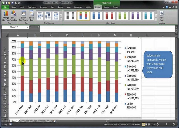
4. Stack Bar Chart
This type of Excel chart can visualize the relationship found within your data sets. Every within the stack Bar chart is meant to represent a whole. Within the bars, different colors are utilized to illustrate certain parts of the whole thing. The chart is straightforward to use and has the power to bring to light hidden insights within the data.
Using this chart gives you the freedom to see a percentage of each data compared to the entire value. The chart is easy to plot and generate the final diagram, thus saving much of your time to get working on other things. The steps for creating a stack Bar chart are the same, only that you chose the stack bar chart option. You can then make changes such as colors and many more.
5. Radar Chart
Radar Chart is among the advanced charts in excel that got its name from its shape. The chart looks like a spider web, where different variables are presented in different shapes. The chart is easy to customize and comprehend due to its simple nature. Also, you can easily identify patterns and trends within the data when using advanced charts in excel.
Remember that you should install the ChartExpo extension to make your work easier when creating a Radar Chart. The procedure remains the same as other types of charts, only that at the end, you choose the radar chart option before you click on the create chart button. At this point, you will have all your data presented in an organized way and are ready to draw insights.
Conclusion
Excel has some of the best charts with advanced features to enable you to organize and present your data in an orderly way. The only thing you need to learn is to create and use different types of charts in Excel. This article has discussed some of the top charts in Excel and how you can use them.


